class: center, middle, inverse, title-slide .title[ # Introduction to ggplot2 ] --- class: inverse, center, middle # 👋 Welcome! --- ## Schedule ### 1. Introduction to `{ggplot2}` ### 2. `{ggplot2}` concepts ### 3. Advanced customization ### 4. Extensions --- ## Prerequisites You need a laptop with the following installed: - R version >= 4.1 and RStudio >= 2022.02.1 - R package development toolchain: Rtools(windows) or XCode (mac) or<br>r-base-dev - The following packages: ```r my_packages <- c("rmarkdown", "knitr", "tidyverse", 'patchwork', "cowplot", 'colorspace', 'ggtext', 'ggokabeito', 'ggthemes', 'ggdist', 'GGally', 'ggrepel', 'ggpubr', 'ggstatsplot', 'ggdag', 'plotly', 'ggiraph') install.packages(my_packages) install.packages("devtools") devtools::install_github("haleyjeppson/NCME23data") devtools::install_github("kassambara/ggcorrplot") ``` ### WiFi - Username: AERA2023 - Password: AERA2023 --- class: inverse ## Outline <br> ### 1. Set up ### 2. Intro to `{ggplot2}` ### 3. Motivating example --- ## Get started ### 1. Get workshop materials - Clone the [workshop repo](https://github.com/haleyjeppson/NCME23) from GitHub to work locally - Follow along [here](https://haleyjeppson.github.io/NCME23/) ### 2. Create a new R Markdown document or R script - You can follow along in either an .Rmd or R script ### 3. Attach R packages ```r # General use packages: library(tidyverse) library(NCME23data) ``` --- ## Learning Goals Upon completion of this workshop, you will be able to: 1. **identify** the appropriate plot types and corresponding `{ggplot2}` geoms to consider when visualizing your data; 2. **implement** the ggplot2 grammar of graphics by using `ggplot()` and build up plots with the `+` operator; 3. **iterate** through multiple visualizations of your data by changing the aesthetic mappings, geometries, and other graph properties; 4. **incorporate** interaction and custom elements (colors, fonts, etc.) into your visualizations by adjusting `{ggplot2}` theme elements; and 5. **investigate** the world of `{ggplot2}` independently to expand upon the skills learned in the course. --- class: inverse, center, top background-image: url(https://raw.githubusercontent.com/allisonhorst/stats-illustrations/master/rstats-artwork/ggplot2_exploratory.png) background-size: 550px background-position: 50% 60% ## Introduction to `{ggplot2}` <br/><br/><br/><br/><br/><br/><br/><br/><br/> <br/><br/><br/><br/><br/><br/><br/><br/><br/> <p style="font-size:15px;">Artwork by <a href="https://twitter.com/allison_horst?ref_src=twsrc%5Egoogle%7Ctwcamp%5Eserp%7Ctwgr%5Eauthor">@allison_horst</a></p> --- ## The `{ggplot2}` Package <br/> ... is an **R package to visualize data** created by Hadley Wickham in 2005 ```r # install.packages("ggplot2") library(ggplot2) ``` <br/> ... is part of the `{tidyverse}` ```r # install.packages("tidyverse") library(tidyverse) ``` --- class: center, bottom background-image: url(https://raw.githubusercontent.com/rstudio/hex-stickers/master/PNG/ggplot2.png) background-size: 300px background-position: 50% 10% ### `{ggplot2}` **is a system for declaratively creating <br>graphics, based on "The Grammar of Graphics" <br>(Wilkinson, 2005)** You provide the data, tell `{ggplot2}` how to **map variables to aesthetics**,<br> what graphical primitives to use, and it takes care of the details. ??? graphical primitives = geoms / what visual is your data translated into --- ## Why `{ggplot2}`? - designed to adhere to good graphical practices (uses the grammar <br>of graphics) - flexible system that supports a wide of variety plot types - constructs plots using the concept of layers - lots of additional functionality thanks to extensions - active and helpful community ??? layering = continue to build upon a plot by adding additional elements to it --- ## Grammar of graphics - Developed by Leland Wilkinson - Think about graphical forms rather than a limited set of graphs - Different types of graphs may appear completely distinct, but share many common elements. - By making different visual choices, you can use graphs to highlight different aspects of the same data. <!-- For example, here are three ways of displaying the same data: --> <img src="introduction_files/figure-html/plots-3-1.png" /> ??? - Charts are instances of much more general objects - An abstraction which makes thinking, reasoning, and communicating graphics easier --- ## A layered grammar of graphics A graphical representation (plot) in ggplot2 consists of: 1. **default data and mappings** (`aes`): data variables are mapped to visual properties of the graphical elements 2. **one or more layers**: <ul> <li style=margin-top:-0.8em;> geometric element (<code class="r,css,yaml remark-inline-code">geom</code>, such as point, line, rectangle, text, ...),</li> <li>statistical transformation (<code class="r,css,yaml remark-inline-code">stat</code>, such as identity, counts, bins, ...), </li> <li>position adjustment, </li> <li>(optional) one dataset and set of aesthetic mappings</li> </ul> 3. **scales**: map values in the data space to values in an aesthetic space 4. **coordinate system** (`coord`): normally Cartesian, but could use polar coordinates for pie charts or different mapping coordinates 5. **facetting**: for small multiples (subsets) and their arrangement 6. **theme**: fine-tune display items, such as font and its size, color of background, margins, ... ??? ### Data - Representation of data defines what can be done with it - Grammar requires a "tidy" format ### Mapping - Aesthetic mapping: Link variables in data to graphical properties in the geometry. ### Statistics - Even though data is tidy it may not represent the displayed values - Transform input variables to displayed values: - Count number of obs in each category for a bar chart - Calculate summary statistics for a boxplot. - is implicit in many plot types but can often be done prior to plotting ### Geometries - How to interpret aesthetics as graphical representations - (Mostly) determines your plot type ### Position - How to deal with overlap, if any - `{ggplot2}` has smart defaults here, less work for you ### Scales map values in the data space to values in an aesthetic space - Categories → Colour - Numbers → Position - Imply a specific interpretation of values; discrete, continuous, etc ### Coordinates - how data are positioned in a 2D data visualization - normally Cartesian, but could use polar coordinates for pie charts or different mapping coordinates. ### Facets for small multiples (subsets) and their arrangement ### theme - None of the priors talked about the visual look of the plot. - describes the appearance of the plot - Theming spans every part of the graphic that is not linked to data fine-tune display items, such as font and its size, color of background, margins, --- class: inverse, center background-image: url(https://pbs.twimg.com/media/FsyupyWWwAIt7LM?format=jpg&name=small) background-size: 450px background-position: 50% 65% ## The `{ggplot2}` showcase <br/><br/><br/><br/><br/><br/><br/><br/><br/> <br/><br/><br/><br/><br/><br/><br/><br/><br/> <p style="font-size:15px;">by <a href="https://twitter.com/taferreiraua/status/1642881290151108608">Thays Ferreira</a></p> --- .full-width[ .pull-left[  <p style="font-size:15px;margin-top:-3em;text-align:center;">by <a href="https://fediscience.org/@andrew/109558941216921694">Andrew Heiss</a></p> .center[ <img src="https://www.datanovia.com/en/wp-content/uploads/dn-tutorials/ggplot2/figures/128-ggplot-examples-marginal-density-plots-1.png" width="300px" /> <p style="font-size:15px;margin-top:-3em;text-align:center;">by <a href="https://www.datanovia.com/en/blog/ggplot-examples-best-reference/#scatter-plot">Datanovia.com</a></p> ]] .pull-right2[  <p style="font-size:15px;margin-top:-3em;text-align:center;">by <a href="https://github.com/Z3tt/TidyTuesday/tree/main/plots/2020_31">Cédric Scherer</a></p> ]] --- class: bottom, inverse background-image: url(images/evolution.gif) background-size: 560px background-position: 50% 50% <!-- ### Evolution of a plot --> <!-- <img src="" width = "70%"> --> <p style="font-size:14px;margin-right: -2em;margin-bottom: 0em;text-align: right;">by <a href="https://github.com/Z3tt/TidyTuesday/tree/main/plots/2020_31">Cédric Scherer</a></p> --- class: inverse, center, top background-image: url(https://raw.githubusercontent.com/allisonhorst/stats-illustrations/master/rstats-artwork/ggplot2_masterpiece.png) background-size: 650px background-position: 50% 60% # Motivating Example <br/><br/><br/><br/><br/><br/><br/><br/><br/> <br/><br/><br/><br/><br/><br/><br/><br/> <p style="font-size:15px;">Artwork by <a href="https://twitter.com/allison_horst?ref_src=twsrc%5Egoogle%7Ctwcamp%5Eserp%7Ctwgr%5Eauthor">@allison_horst</a></p> --- <!-- --> --- <!-- --> ??? or what relationships we want to see --- <!-- --> --- <!-- --> --- <!-- --> --- <!-- --> --- <!-- --> --- <!-- --> --- 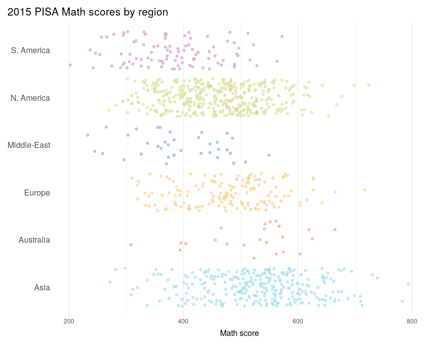<!-- --> --- 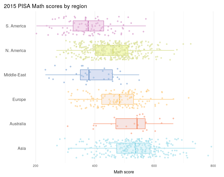<!-- --> --- 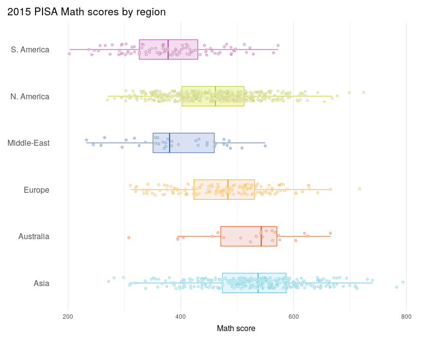<!-- --> --- 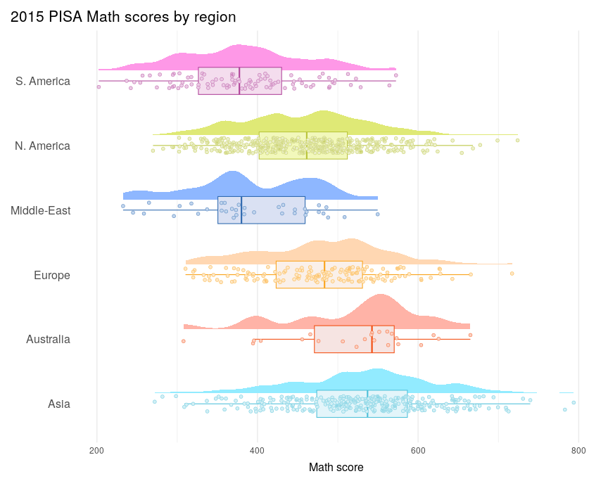<!-- --> --- 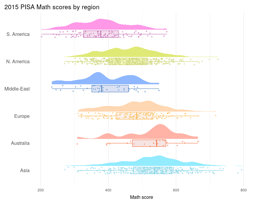<!-- --> --- 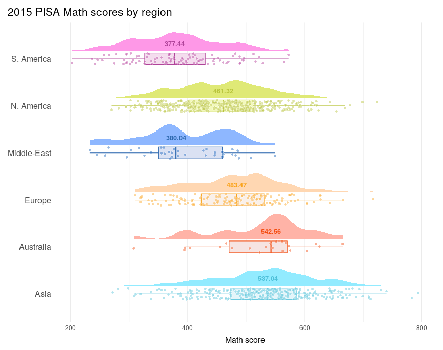<!-- --> --- class: yourturn .center[ ## Your Turn ] ### Talk with your neighbor, introduce yourself, brainstorm:<br> - What other features would you like to include?<br> - What other types of visualizations would you like to see? <img src="introduction_files/figure-html/unnamed-chunk-19-1.png" style="display: block; margin: auto;" /> ??? - What other features would you like to include in additional iterations of this data visualization? - What other visualizations would you like to see? --- ## Resources - Documentation: http://ggplot2.tidyverse.org/reference/ - RStudio cheat sheet for [ggplot2](https://posit.co/wp-content/uploads/2022/10/data-visualization-1.pdf) - Sam Tyner's [ggplot2 workshop](https://sctyner.github.io/user20-proposal.html) - Thomas Lin Pedersen's ggplot2 webinar: [part 1](https://youtu.be/h29g21z0a68) and [part 2](https://youtu.be/0m4yywqNPVY) - Cedric Scherer's ["A ggplot2 tutorial for beautiful plotting in R"](https://www.cedricscherer.com/2019/08/05/a-ggplot2-tutorial-for-beautiful-plotting-in-r/#legends)